
When I first looked at Vosita's provider profiles in late 2022, I immediately noticed how much mental effort it took to find basic information. Navigating the dense, unstructured information was a struggle. The existing design didn’t support how people actually research healthcare providers. They needed clearer pathways to key information and booking.
Vosita / Information architecture / Late 2022
Clarity at the point of decision.
Helping patients understand a provider and find the next available appointment.
My roleUX, visual design & prototyping
ScopeProvider profiles on desktop & mobile
OutcomeClearer hierarchy and persistent booking access
Overview
The challenge
- Important details like specialties and availability were hard to find in the wide, two-column layout.
- The booking CTA disappeared as users scrolled.
- Reading reviews required leaving the page, disrupting the decision-making process.
Research observations
User testing sessions revealed consistent patterns. People’s eyes darted across the wide layout as they struggled to build a complete picture of the provider. Many missed the booking option entirely after scrolling, while others abandoned the process when reviews opened in a new tab.
We also discovered that providers with longer bios actually had lower conversion rates, suggesting our information hierarchy was broken.
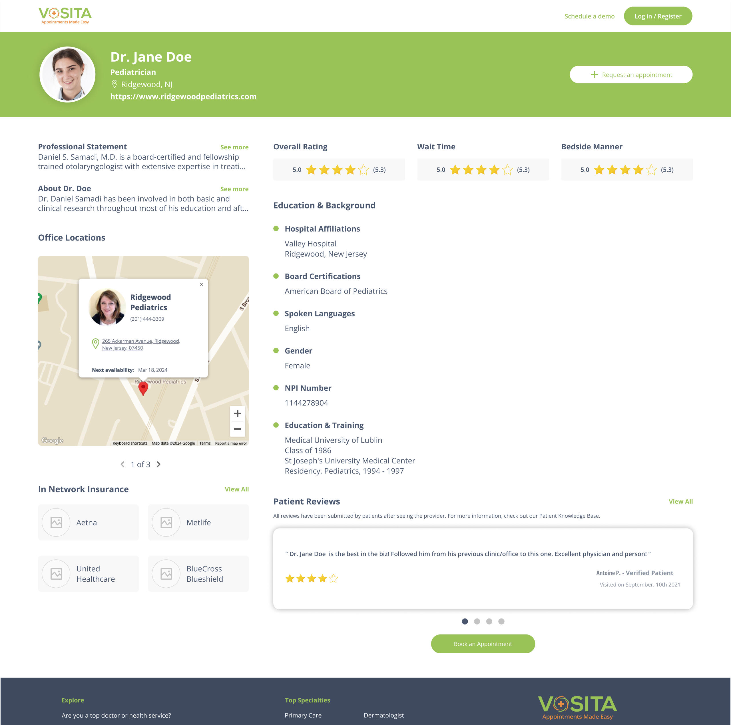
The original profile had:
- A wide header with the provider’s name and a non-sticky "Availability" button.
- A small left column with the bio and map.
- A wide right column with scattered details and reviews at the very bottom.
Key Pain Points:
- Users missed the booking CTA after scrolling.
- Reviews were buried.
- Mobile users had to scroll excessively.
Design decisions
The redesign focused on creating a clear information hierarchy. I moved from the sprawling two-column layout to a more structured single-column approach with a persistent sidebar. This kept the provider's core information and booking CTA always accessible. Key improvements included:
- A fixed sidebar kept booking options visible as users scrolled.
- Integrated reviews expanded in place, so users did not have to navigate away.
- The mobile experience prioritized key information, and a “Back to top” feature helped users navigate long review sections.
- For mobile, I collapsed secondary information into expandable sections so patients could focus on what mattered most when making their decision.
Outcomes & reflection
- More users were reaching the booking confirmation page.
- Providers reported increased profile engagement.
- Providers appreciated the more professional presentation of their information.
- This project reinforced how important information design is in healthcare. When we make interfaces clearer, we help people make better decisions about their care.