
In Q3 2024, while conducting usability tests with focus groups, one metric I analyzed was the total journey duration—the time from a user's first interaction to a successful booking. The results revealed a significant gap in journey times between guest users and logged-in patients. Both groups experienced frustration, with completion times exceeding our target. This highlighted a major opportunity to enhance the platform's most crucial flow: the patient booking experience.
Vosita / Patient experience / Q3 2024
A shorter path to better care.
Redesigning the Vosita booking journey—from finding a doctor to confirming an appointment.
My roleUX, visual design & prototyping
ScopeSearch, results, signup and booking
Outcome4.2-minute average journey in reported testing
Overview
The challenge
Our usability study uncovered that the average total journey duration was 11 minutes, with the worst-case scenario reaching 17 minutes. Guest users took approximately two minutes longer than logged-in patients to complete a booking, and some users on the mobile website and in the app failed to complete the process altogether. Our objective was to streamline the experience, aiming for a total journey time of under 5 minutes.
Understanding the journey
Analyzing the Guest User’s Journey
The guest user journey on Vosita began on the homepage, where users would input details like their desired specialty or provider name, location, insurance, preferred date, and appointment type (in-office or virtual). Once they hit search, they’d land on the results page, which displayed a list of available doctors matching their criteria along with open time slots.
However, if a guest user selected a time slot without being signed in, they’d be redirected to the login page. New users without an account would then need to locate the sign-up button to create one. After signing up, they’d have to manually log in, which would finally take them to the booking confirmation page.
But here’s where things got tricky. To prevent fake bookings, users were required to verify their email address and provide a mobile number (which wasn’t collected during sign-up). Most users, unaware they could simply check their inbox in a new tab, would navigate away from the booking page to their profile settings to confirm their email. This action reset their progress, forcing them to start over: re-entering their search criteria, selecting a doctor, choosing a time slot, and confirming their mobile number through a modal wizard. Only then could they finally book their appointment.
This back-and-forth created unnecessary friction and frustration, often leading users to abandon the process altogether. It became clear that simplifying and streamlining this journey was critical to improving the overall user experience.
Breaking Down the Journey
To tackle this, I broke the guest user journey into four key flows:
- Search Bar
- Search Results Page
- Sign-Up/Login Flow and Credentials Confirmation
- Booking Page
1. Search Bar
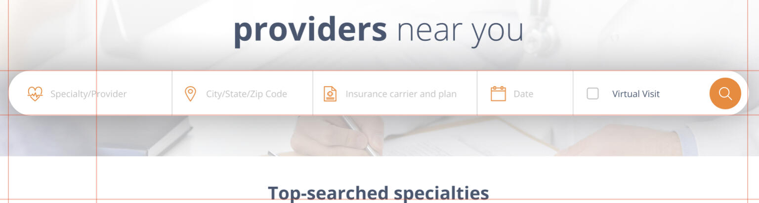
The search bar was packed with fields: provider/specialty, location, insurance, date, and a virtual visit checkbox, followed by three buttons: search, more filters, and reset. While functional, it felt overwhelming and could use some simplification.
Provider/Specialty Field: Users could type a provider’s name, but even if the provider appeared in the dropdown, clicking on them didn’t take users directly to their profile. Instead, they had to hit “search,” wait for the results page, and then click on the provider again. I wondered: why not let users go straight to the provider’s profile if they’re already selecting them from the dropdown?
Location Field: This field started blank, requiring users to manually enter their location. If they declined the browser’s GPS prompt, we defaulted to an IP-based location, which was less accurate. This led to confusion and frustration, especially for users who weren’t sure why their location wasn’t auto-populated.
Insurance Selection: This was the #1 pain point, reported by about 18% of users. The process was split into two tabs: carrier and plan. Users would first select a carrier from an alphabetical list, then choose a plan. However, they could skip the carrier step entirely by clicking the “Plans” tab, which broke the UI. I wondered: why not make carrier selection more intuitive and prevent users from advancing without selecting a carrier first?
Date Field: The date field auto-filled with the current day in “MM-DD-YYYY” format. While helpful, not all users immediately recognized today’s date, so I considered making the date display clearer and more user-friendly.
Virtual Visit Checkbox: This was another point of confusion. Users weren’t sure whether checking the box would include virtual visits alongside in-office appointments or show only virtual visits (it was the latter). This lack of clarity added unnecessary cognitive load.
Buttons: At the end of the search bar were three identically styled buttons: search, more filters, and reset. Not only were they unlabeled (relying on hover tooltips), but the most important button—search—was placed first, followed by the less critical ones. Considering the serial position effect, I wondered whether the search button should be more prominent and placed last to guide users naturally through the flow.
Mobile Web Experience: On the mobile website, the search bar stacked vertically, extending below the fold on page load. This created a jarring experience where users would hit “search” and not realize they’d navigated to a new page because the search bar looked identical on both the homepage and search results page. I believed a more compact, mobile-friendly search bar was needed to provide better visual feedback and improve usability.
This analysis highlighted several opportunities to streamline the search bar and reduce cognitive load, setting the stage for a more intuitive and efficient booking experience.
2. Search Results Page
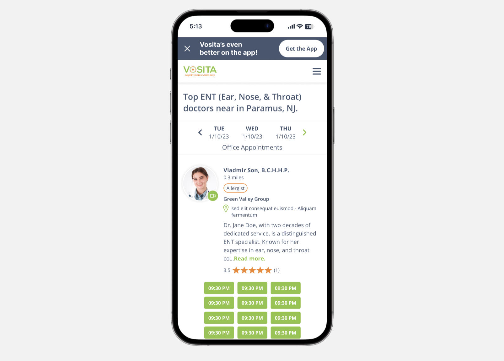
Provider cards on mobile stacked vertically, with the provider info on top and the time slot at the bottom. This resulted in long cards that occupied the entire screen. I thought compact cards that allowed two or three providers to be displayed at the same time would reduce scrolling and improve the experience.
3. Sign-Up/Login Flow and Credentials Confirmation
Clicking on a time slot in the search results led to the login page. Unregistered users had to navigate through sign-up, log in again, then return to the booking page, only to verify their email addresses and add their mobile numbers, resulting in significant drop-offs and a convoluted process.
I realized most guests wouldn’t be registered on Vosita, so it made more sense to direct them to sign up by default instead of asking them to log in. I also thought redirecting away from the search results page was unnecessary and proposed displaying a sign-up modal when a guest selected a time slot.
Additionally, I questioned the need for email verification. Patients signing up with a mobile number could use it for login as well. I believed the sign-up fields could be fewer, and that we could verify mobile numbers or emails during sign-up. This way, after creating accounts, users would be automatically signed in and redirected to the booking page, where they’d only need to confirm appointment details without additional verification steps.
This reimagined flow aimed to eliminate unnecessary steps, reduce friction, and create a seamless experience for users.
4. Booking Page
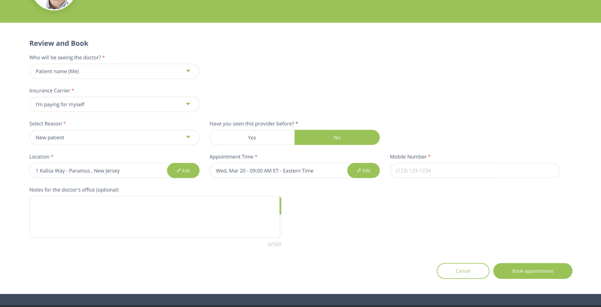
The booking page was too wide, with rows containing up to four fields. I thought the layout didn’t guide the user effectively. A narrower layout with fields stacked vertically would create a more intuitive and focused experience.
This deep dive into the guest user journey revealed multiple pain points and opportunities for improvement. By addressing these issues, I aimed to create a smoother, more efficient booking experience that would reduce frustration and increase completion rates.
Design decisions
1. Search Bar
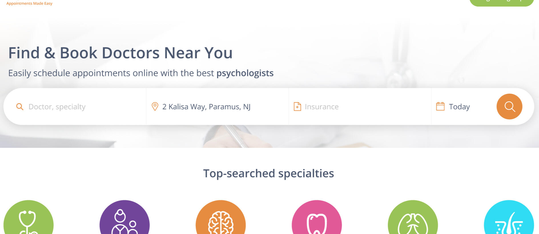
I reworked the search bar to make it more intuitive and efficient, starting with the following key updates:
Provider Field
I updated the flow so that when a user searches for a provider and selects them from the dropdown, they’re taken directly to the doctor’s profile page. This eliminated the extra step of hitting “search” and then clicking on the provider again in the results.
I also simplified the placeholder text. It originally read, “Provider Specialty/Provider/Org,” but I changed it to “Doctor, specialty.” I’ve been advocating for using “doctor” instead of “provider” across the platform because it’s simpler and resonates better with the average patient.
Insurance Selection
I kept the two-tab layout (carrier and plan) but updated the UI to make it more user-friendly. I alphabetized the list and added a “Popular” section at the top, which displays carriers commonly used in the user’s location.
To prevent users from skipping the carrier selection, I made it so they can’t proceed to the “Plans” tab without first choosing a carrier. I also added a sticky “Continue without insurance” button for users who either aren’t sure about their insurance or don’t have it. This gave users more flexibility while maintaining a clear path forward.
Date Field
The date field previously auto-filled with the current day in “MM-DD-YYYY” format. I changed it to simply display “Today.” My reasoning was that not all users would immediately recognize the current date, and I wanted to save them the effort of checking their phone or another part of the screen to confirm. “Today” is clear, affirming, and reduces cognitive load.
Virtual Visit Checkbox
I removed this field entirely. Vosita launched in 2020 during the peak of the COVID-19 pandemic, when telemedicine was a top priority. However, as the platform evolved, this checkbox felt like a relic of that time.
Since virtual visit options were already available in the filters on the search results page, I decided to remove this checkbox to reduce cognitive load and streamline the search process. My goal was to get patients searching and viewing doctors as quickly as possible.
Buttons
I removed the “More filters” and “Reset” buttons from the search bar. These buttons competed with the “Search” button and weren’t essential to the initial search experience. By eliminating them, I was left with a single, prominent orange “Search” button. This made the interface simpler and more focused, encouraging users to start their search right away.
Mobile Web Experience
On mobile, I eliminated the gaps between fields to create a compact search bar that fits above the fold on most devices. On the search results page, I replaced the original search bar (which was identical to the homepage version) with a new sticky bar. This sticky bar displays the appointment type and the number of doctors found, along with a “Filters” button that opens an overlay for adjusting search criteria. This change completely eliminated the confusion users experienced when they didn’t realize they’d been taken to a new page after hitting “Search” on the homepage.
The new sticky bar takes up minimal vertical space, allowing the list of providers to be displayed front and center. This aligns better with user expectations and creates a more seamless experience.
These updates to the search bar were designed to reduce friction, minimize cognitive load, and get users to their desired results as quickly as possible. By simplifying the interface and streamlining the flow, I aimed to create a more intuitive and efficient booking experience.
2. Search Results Page
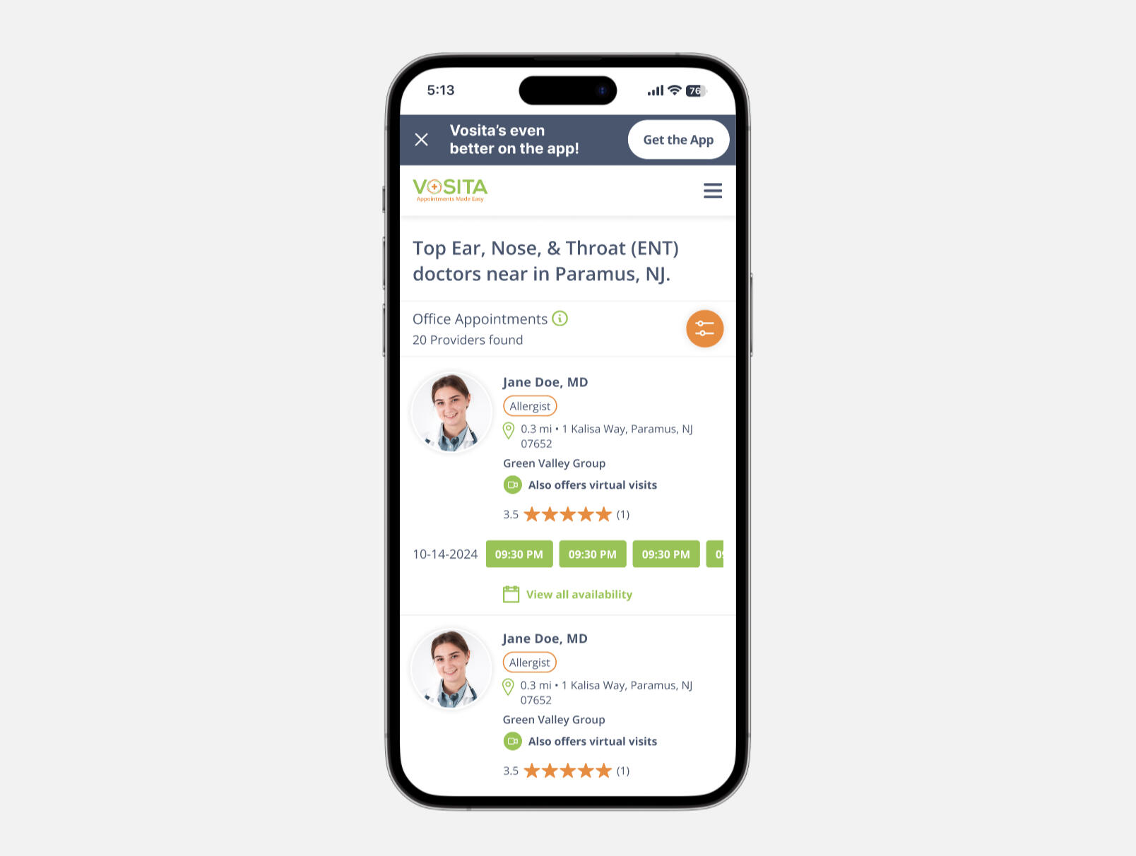
On mobile, vertical space is precious. To optimize the layout, I eliminated the provider summary that was displayed on desktop under each result. Instead, I kept only the essentials: the provider’s photo, name, specialty, location, rating, and available time slots.
Time slots were a major space hog, so I reimagined their display. Instead of the 5-column grid used on desktop, I streamlined it to show only the time slots for the day the user searched for, displayed in a single row with side scrolling. This approach minimized vertical space, allowing up to three providers to be displayed at a time. The result? Less scrolling and a more intuitive browsing experience for users.
3. Sign-Up/Login Flow and Credentials Confirmation
I shifted the flow to assume that guest patients likely didn’t have accounts on Vosita. Now, when users click on a provider’s time slot, they’re taken directly to the sign-up flow instead of being redirected to the login page first.
To preserve continuity, I designed a sign-up modal that pops up when a patient selects a time slot. This keeps users on the same page, eliminating the jarring experience of navigating away. I also simplified the sign-up form by removing the “Confirm Password” field, since we already had a “Forgot Password” option on the login page. By default, we now only ask for a mobile number instead of requiring both an email address and a mobile number. Users can optionally add and verify their email later, but the mobile number is sufficient for booking. To make the process even smoother, I added single sign-on (SSO), allowing users to skip filling out fields altogether and go straight to the booking page to confirm their appointment. These changes significantly reduced friction, enabling users to complete the process in fewer steps and with less effort.
4. Booking Page
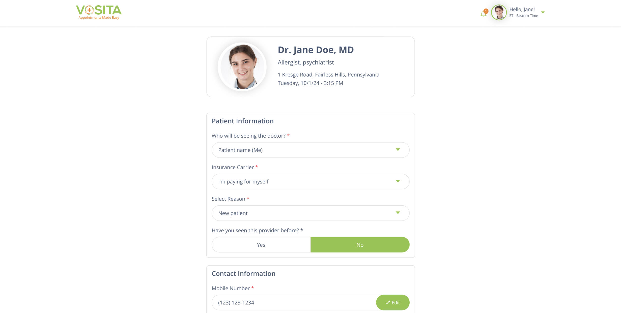
I completely redesigned the booking page to make it more user-friendly. The new layout is narrower and uses a single-column design, creating a more focused and guided experience.
At the top of the page, I added an appointment summary that displays the provider’s details and the selected time slot. Below that, I stacked the fields vertically, grouping them into sections based on the type of information (e.g., personal information and appointment details). Since mobile numbers are now collected and verified during sign-up, the mobile number field is pre-filled, and we no longer ask new users to verify their email. This means most fields are already filled in by the time users reach the booking page. For most patients, it’s as simple as reviewing the summary and hitting “Book Appointment”—done!
These updates to the search results page, sign-up/login flow, and booking page were all aimed at creating a smoother, more intuitive experience for users. By minimizing friction, reducing unnecessary steps, and optimizing the layout, I was able to streamline the entire booking process.
Results & feedback
Total Journey Time
Before: The average total journey time was 11 minutes, with guest users taking around 13 minutes and logged-in patients taking 11 minutes. The worst-case scenario was 17 minutes.
After: The average total journey time dropped to 4.2 minutes, with guest users completing bookings in 4.5 minutes and logged-in patients in 4 minutes. This met our goal of a sub-5-minute booking experience.
Completion Rates
Before: Approximately 30% of guest users and 40% of logged-in patients failed to complete bookings on the mobile website and in the app.
After: Completion rates improved significantly, with 100% of patients successfully booking appointments.
User Feedback
- Users reported that the process felt faster, simpler, and more intuitive.
- The removal of unnecessary steps (e.g., email verification, redundant fields) was particularly well received.
- The sticky search bar on mobile and the compact provider cards were praised for making the experience more seamless.
Reduced Cognitive Load
- Simplifying the search bar (e.g., removing the virtual visit checkbox, streamlining insurance selection) led to a noticeable decrease in user confusion.
- The single-column layout on the booking page and the appointment summary at the top helped users feel more in control of the process.
Mobile Optimization
- The compact search bar and side-scrolling time slots on mobile reduced scrolling and made the search results page easier to navigate.
- Users appreciated not being redirected to a new page during the sign-up process, as the modal preserved continuity.
What I learned
Assumptions Can Be Powerful (When Validated)
Assuming that most guest users didn’t have accounts and directing them straight to the sign-up flow proved to be a game-changer. This small shift eliminated unnecessary steps and reduced frustration.
Less Is More
Removing non-essential fields (e.g., virtual visit checkbox, confirm password) and simplifying the UI significantly improved the user experience. Users don’t need every option upfront—they just want to complete their task efficiently.
Mobile-First Design Is Critical
Optimizing for mobile wasn’t just about aesthetics; it was about respecting users’ time and attention. The sticky search bar and compact provider cards were small changes that had a big impact on usability.
Continuity Matters
Keeping users on the same page (e.g., using modals for sign-up instead of redirects) helped maintain focus and reduced the likelihood of drop-offs.