Vosita, a healthcare platform connecting patients with providers, launched in 2020 with a basic, feature-limited product. By 2022, the platform struggled to compete with established players like Zocdoc due to inconsistent design, disorganized assets, and a lack of cohesive branding. I joined the team to lead the redesign effort, known internally as "Vosita 2.0," with the goal of creating a scalable, user-friendly, and visually appealing platform.
Vosita 2.0 / Design systems
One system. A more coherent product.
Creating a shared design foundation while rebuilding a complex healthcare platform.
My roleUX, visual design & prototyping
ScopeWeb, mobile and multi-role flows
OutcomeShared components, tokens and documentation
Overview
The challenge
Scattered and Disorganized Files
When I joined Vosita, the design files were scattered between Adobe XD and Figma, with most of the work in XD. The team had recently decided to switch to Figma, so newer files were there, but the transition was messy. Since the company had relied heavily on freelancers for UX work before I came on board, files had passed through many hands, leaving things disorganized. Components, auto-layout, and grids were nowhere to be found—everything was manually grouped and placed, making the files a tangled mess.
Lack of a Design System
Without a design system or style guide, inconsistencies were everywhere. Navigation bars, buttons, input fields, headers, footers, breakpoints, margins, border radii, typefaces—you name it—all looked different from page to page. Even basic elements like font weights, colors, sizes, and spacing didn’t match. Global changes were impossible because nothing was tied to components. For important changes, I had to go through all the relevant instances and update them individually. It was clear: Vosita desperately needed a design system and a shared library.
Inconsistent Color Palette
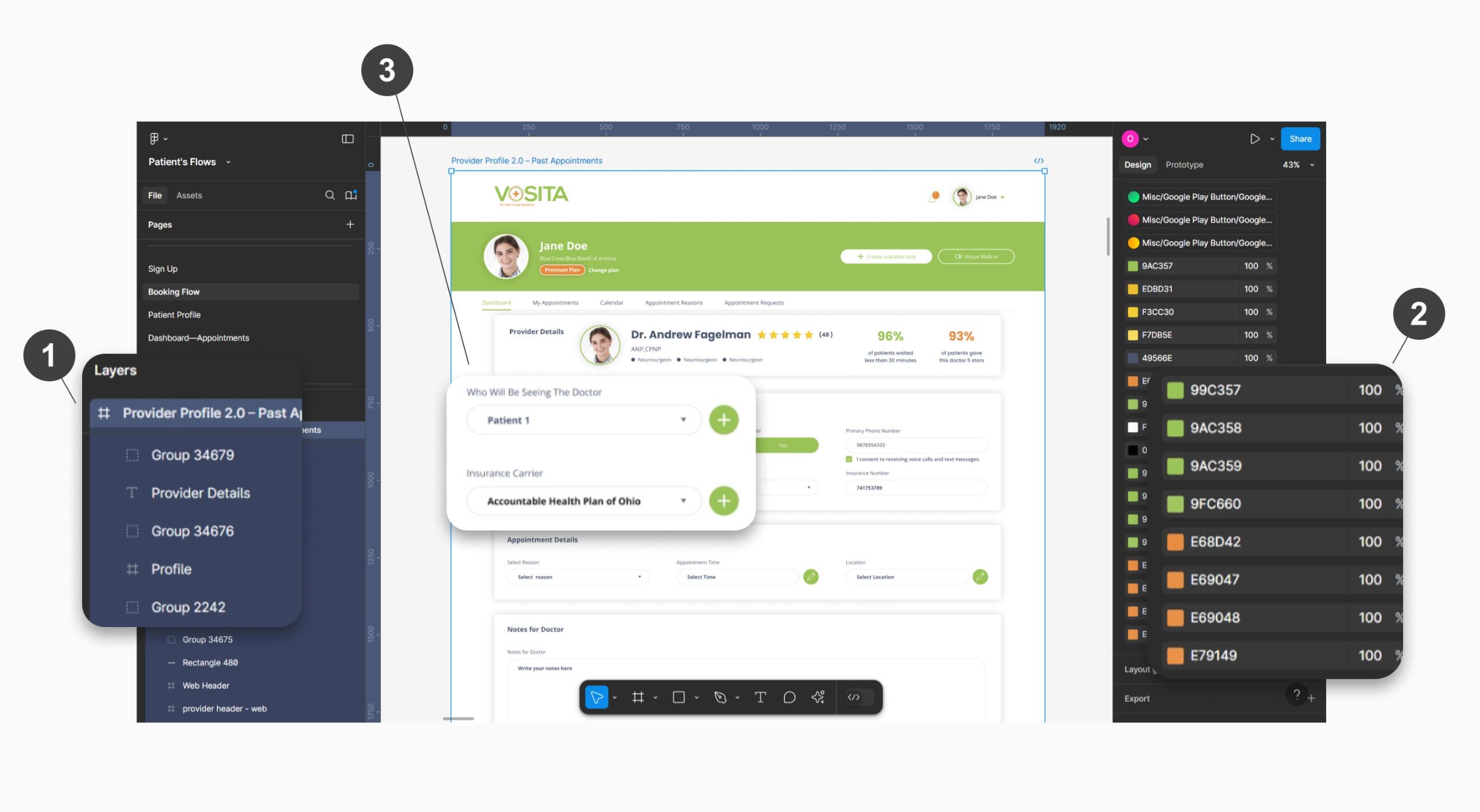
The color palette was another issue. The only consistent colors were Vosita’s green and orange, pulled from the logo. But even these had slight hex code variations, likely because previous designers used the eyedropper tool on logo images. Beyond that, colors were a mess—20+ shades of gray for disabled buttons, 10 reds for errors, 10 greens for buttons, and so on.
Version Control Issues
Version control was a constant struggle. Parts of the same user flow were split between XD and Figma, and even though Figma files were newer, they weren’t always prioritized for implementation. Developers had to switch between the two, often unsure which files were up-to-date and which were obsolete.
Discrepancies Between Design and Development
The live product looked very different from the design references, mostly due to a lack of coordination between designers and front-end developers.
A Large and Complex Platform
Finally, Vosita was already a massive project, catering to patients, independent providers, and medical groups. With features like virtual visits, tiered pricing, and apps for iOS and Android, the platform was massive—and massively inconsistent. On top of that, Vosita was racing to catch up to competitors who’d been in the game for nearly two decades.
Balancing Legacy and New Designs
Balancing old and new was tricky. I had to clean up legacy files while simultaneously researching, wireframing, and prototyping new features. Without a design library in place, creating new flows only added to the inconsistency. It was a constant juggle: fixing the past while building the future, all while trying to establish a foundation for consistency.
Audit & approach
Assessing the Current State
The first step was migrating everything from Adobe XD to Figma. The project was divided into six files: Provider Flows, Patient Flows, Group Flows, Admin Flows, Informational Pages, and the Mobile App (which included provider, patient, and group flows). I began by comparing versions between Figma and XD, consolidating duplicates, and creating clear naming conventions for each flow. I also organized the files and documented their states—whether they reflected the current production version, were works in progress (WIP), or were outdated and obsolete. To make the design files more accessible, I created a wiki on Azure with links to all the design files. This allowed the development team, QA, BA, and other stakeholders to quickly access the latest designs. By the end of this process, everything was successfully moved to Figma and documented in the wiki. While the transferred files still needed cleanup, having everything in one place was a major milestone.
Identifying Inconsistencies
Next, I tackled the inconsistencies in the design system. The color palette was a mess—Vosita’s green and orange were the primary colors, but their hex codes varied slightly across files. Text colors alternated between navy blue and black, and there were multiple shades of red, gray, and other colors used inconsistently. Typography was equally chaotic, with Poppins used on the website but random sans-serif fonts in marketing materials and the mobile app. Font sizes, weights, and spacing varied wildly from page to page.
Planning the Solution
I knew I needed to establish a solid foundation before diving into components. I decided to start with the basics: colors, typography, and spacing. I planned to standardize the color palette, define a universal font, and create a type system with consistent sizes, weights, and spacing. I also wanted to introduce variables for primitives and tokens to create a scalable design system.
Following Atomic Design principles, I planned to break down the UI into atoms (basic elements like buttons and input fields), molecules (functional groups like search forms), and organisms (larger components like headers and footers). I also envisioned creating templates for reusable page layouts, such as profiles and dashboards, to save time and ensure consistency.
Building the system
Standardizing the Color Palette
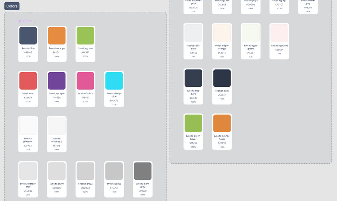
I began by standardizing the color palette. Vosita’s green and orange were the primary colors, but their hex codes varied slightly across files. I locked down the correct hex codes and ensured they were used consistently. For text, I settled on navy blue to replace the inconsistent use of black. I also introduced three shades of gray for disabled states and a single red for errors, replacing the multiple shades previously in use. Tints and shades of the primary colors were added for hover states, creating a more dynamic yet cohesive visual language.
To align the design system with production, I collaborated with the front-end lead. He provided me with all the colors used in the live product, which I mapped to the new palette. This step was crucial because inconsistencies in Figma and XD had spilled over into the live product, as developers were pulling colors directly from the design files. By aligning the design system with production, we drastically reduced the number of colors in use, creating a more unified look.
Defining Typography
Typography was next. I chose Open Sans as the universal font across all platforms, replacing the mix of random sans-serif fonts. I established a type system that defined sizes, weights, and spacing for headings, body text, and other elements. I documented guidelines for when and how each typographic style should be used, ensuring clarity and consistency.
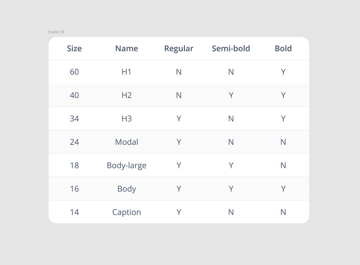
Creating Primitives and Tokens
Before diving into components, I created variables for primitives and tokens. I started with a Primitives collection for colors and spacing. After consulting with the front-end lead, I adopted a 4-point grid system, creating numeric variables in multiples of four for spacing and border radii. I also created a Tokens collection for common design tokens, such as colors and typography, to serve as the foundation for the design system.
Building Components with Atomic Design
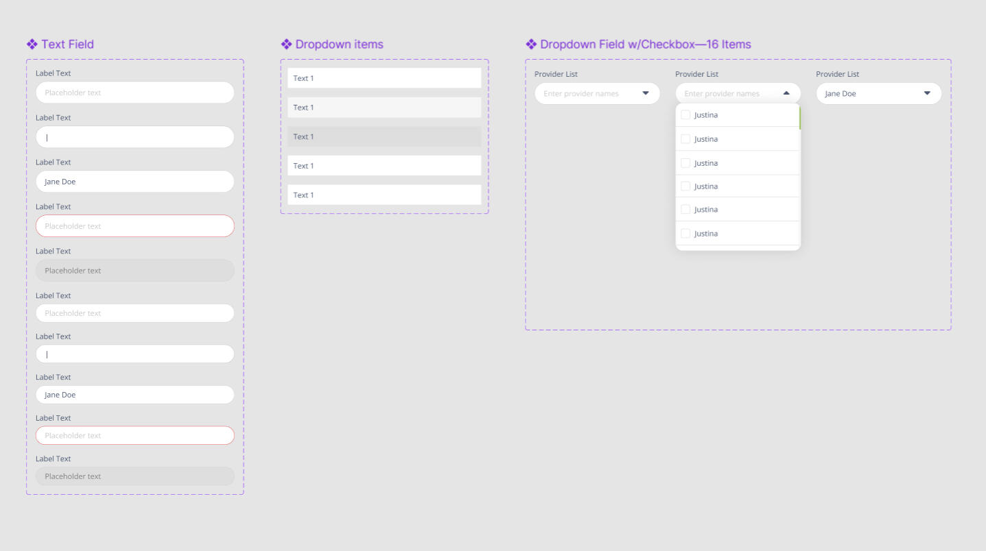
Next, I began building components using Atomic Design principles. I started with atoms—basic elements like input fields, dropdown menus, buttons, radio buttons, toggles, tab buttons, icons, scroll bars, checkboxes, and dividers. These atoms formed the building blocks of the design system.
From there, I combined atoms into molecules—small, functional groups of UI elements. For example, a search form molecule included a form label, search input, and button. The next level was organisms—larger, more complex components like headers, footers, and pagination modules. While I didn’t have every component figured out from the start, I had enough to begin cleaning up the files and linking everything to tokens and components.
Creating Templates for Reusability
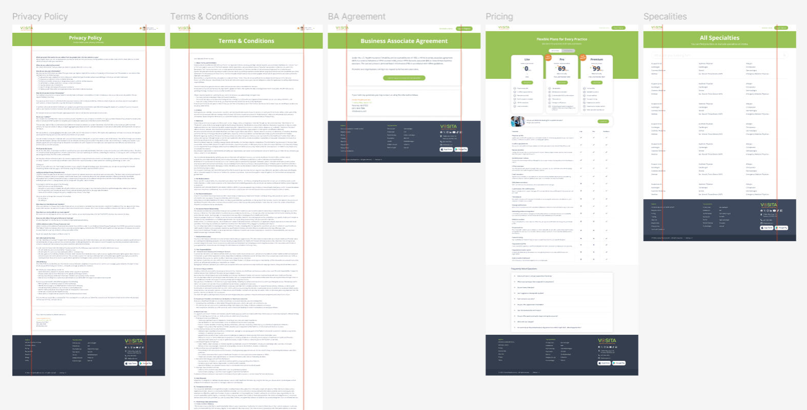
Finally, I created templates—page-level layouts that brought components together and defined the underlying content structure. For example, pages like Terms, Privacy Policy, Contact, and Pricing shared the same basic design, differing only in content. By creating a template for these, I saved significant time and made global changes much easier. Similarly, patient, provider, and group profiles followed the same structure, so I built a template for those. Public profiles for providers and groups also shared a common layout, as did the dashboards for patients, providers, and groups. These templates not only streamlined the design process but also ensured consistency across the platform.
This approach—starting with atoms, building up to molecules and organisms, and finally creating templates—allowed me to systematically clean up the files while maintaining flexibility for future updates. It was a balancing act, but one that ultimately brought order to the chaos and set the stage for a scalable, cohesive design system.
Validation & iteration
Testing and Validation
With the design system in place, the next step was to validate its effectiveness. I conducted usability testing to ensure the new components and templates worked as intended. This involved creating designs and prototypes using the updated design system.
Usability testing also included the front-end and QA teams to ensure the design system aligned with development workflows. The feedback received emphasized the improved consistency and ease of navigation.
Iterating Based on Feedback
The feedback loop was crucial. As I worked on new designs or cleaned up old files, I continuously refined the component library. If I noticed a component was missing a Boolean property or a variant, or had unnecessary complexity, I’d go back and optimize it. This iterative process ensured the library evolved alongside the project, staying flexible and efficient.
For example, during testing, I discovered that some components, like dropdown menus and input fields, needed additional states to handle edge cases. I updated these components and documented the changes in the design system guidelines.
Measuring Success
To measure the impact of the design system, I tracked key metrics such as development speed, consistency across the platform, and user satisfaction. Developers reported that the new system significantly reduced the time required to implement new features, as they no longer had to manually adjust styles or behaviors. The QA team also noted fewer inconsistencies between the design files and the live product, reducing the number of bugs reported.
Handoff & ongoing maintenance
Documenting and Sharing Knowledge
To ensure the design system’s longevity, I created comprehensive documentation, including guidelines for using components, templates, and design tokens.
I introduced the team to the "Ready for Dev" mark in Figma, a simple yet effective way to indicate when a design was finalized and ready for implementation. This streamlined communication between designers and developers, reducing back-and-forth and ensuring everyone was on the same page.
Ongoing Maintenance and Scalability
The design system was designed to grow with Vosita. I established a process for adding new components and updating existing ones, ensuring the system remained scalable and adaptable. Regular reviews and audits were scheduled to identify areas for improvement and address any emerging inconsistencies.
By the end of the project, Vosita had a robust, scalable design system that brought order to the chaos. The platform was not only visually consistent but also more efficient to develop and maintain. The design system became a cornerstone of Vosita’s product strategy, enabling the team to focus on innovation and user experience rather than wrestling with inconsistencies.