Hi, I'm Omar Mansour
I love creating intuitive and engaging digital experiences. I bring clarity to complex problems through research-driven, user-first design. Let’s build something people love to use!

Let's connect

Design System for Vosita 2.0
I transformed Vosita’s inconsistent, fragmented design into a scalable, unified system, balancing legacy cleanup with new features to create a cohesive, user-friendly platform.
Guest Booking Flow Overhaul
Redesigned Vosita’s booking flow to cut average booking time from 11 minutes to under 5, boosting completion rates to 100% with a streamlined, mobile-friendly experience.
Provider Public Profile Redesign
Transformed Vosita's cluttered and scattered public provider profiles into an intuitive, mobile-friendly design, improving navigation and boosting conversion rates.
Login/Signup Redesign
Redesigned Vosita's cluttered signup/login flow to simplify navigation and improve mobile usability. Delivered a seamless, intuitive experience that reduced drop-offs and enhanced user satisfaction.

Microwize Logo Redesign
I redesigned Microwize’s original 1997 logo. The challenge was balancing modernity with familiarity to avoid alienating the existing client base.
Vosita Display Ads
I designed and animated the display ads for the marketing campaign, increasing ad performance by 100%.
JKR Windows
I conceptualized an ad campaign and designed marketing collateral for socials.
Select Works
Select designs for social media and display ads.

2022 Marketing Campaign
Overview
Vosita is an online platform and application that allows patients to find providers based on specialty, insurance network, location, reviews, or the language they speak. When I joined Vosita, I updated its brand identity and created a style guide to ensure consistency. I also designed brand characters.For the 2.0 launch, I collaborated closely with the marketing team to understand their needs. In addition to illustrating and animating the characters, I wrote the script and designed motion graphics for the marketing campaign videos.

Microwize Logo Redesign
Overview
Microwize's old logo had remained unchanged since the company was founded in 1997. As a leader in medical office software and IT solutions, it was essential for Microwize to demonstrate its evolution and relevance in the modern world; thus, they felt their logo was due for an update. Over the past 25 years, Microwize executives had considered a redesign, but they were concerned about maintaining brand recognition.The challenge was to update the logo and its colors while preserving brand identity. Before the redesign, Microwize lacked a consistent visual identity or a brand style guide, so it was not merely a logo redesign; I also created a comprehensive visual identity and brand style guide. Additionally, I developed brand characters and an illustration style for use in digital, print, and motion graphics. I paid close attention to color psychology, emphasizing blue and yellow to reflect values such as loyalty, integrity, and innovation.With the new logo, I introduced the slogan "Helping Doctors and Patients See i to i," which was incorporated into the design.


Vosita Display Ads
Overview
Vosita is an online platform and application that allows patients to find providers based on specialty, insurance network, location, reviews, or the language they speak. When I joined Vosita, I updated its brand identity and created a style guide to ensure consistency. I also designed brand characters. For Vosita's launch, I collaborated with the marketing team to understand their needs. They had already been running display ads for a year, but after updating the brand style guide the old display ads had to be redesigned. I designed and animated the display ads used in the marketing campaign, which improved ad performance by 100%.


JKR Windows
Overview
JKR Windows is a window replacement and installation company operating in Utah. I wanted to emphasize how JKR Windows' cutting-edge technology can save money for its customers by maximizing insulation and minimizing energy loss. I researched Utah's electric service provider to make sure the bill in the ad looks familiar to Utahns!

I wanted the first image to be simple and make a statement. Working with the established brand guidelines, I went with a purple background, glass text, and the bill with the amount due highlighted.


Select Works
Social Media


Display Ads


Creating a Design System for Vosita 2.0
Overview
Vosita, a healthcare platform connecting patients with providers, launched in 2020 with a basic, feature-limited product. By 2022, the platform struggled to compete with established players like Zocdoc due to inconsistent design, disorganized assets, and a lack of cohesive branding. I joined the team to lead the redesign effort, known internally as "Vosita 2.0," with the goal of creating a scalable, user-friendly, and visually appealing platform.
The Challenge
Scattered and Disorganized Files
When I joined Vosita, the design files were scattered between Adobe XD and Figma, with most of the work in XD. The team had recently decided to switch to Figma, so newer files were there, but the transition was messy. Since the company had relied heavily on freelancers for UX work before I came on board, files had passed through many hands, leaving things disorganized. Components, auto-layout, and grids were nowhere to be found—everything was manually grouped and placed, making the files a tangled mess.
Lack of a Design System
Without a design system or style guide, inconsistencies were everywhere. Navigation bars, buttons, input fields, headers, footers, breakpoints, margins, border radiuses, typefaces—you name it—all looked different from page to page. Even basic elements like font weights, colors, sizes, and spacing didn’t match. Global changes were impossible because nothing was tied to components. For important changes, I had to go through all the relevant instances and update them individually. It was clear: Vosita desperately needed a design system and a shared library.
Inconsistent Color Palette
The color palette was another issue. The only consistent colors were Vosita’s green and orange, pulled from the logo. But even these had slight hex code variations, likely because previous designers used the eyedropper tool on logo images. Beyond that, colors were a mess—20+ shades of gray for disabled buttons, 10 reds for errors, 10 greens for buttons, and so on.

1. No auto-layout, no components, 2. Hex code variations of the same colors, 3. Wrong font, inconsistent font color. Click to enlarge image.

Version Control Issues
Version control was a constant struggle. Parts of the same user flow were split between XD and Figma, and even though Figma files were newer, they weren’t always prioritized for implementation. Developers had to juggle between the two, often unsure which files were up-to-date and which were obsolete.
Discrepancies Between Design and Development
The live product looked very different from the design references, mostly due to a lack of coordination between designers and front-end developers.
A Large and Complex Platform
Finally, Vosita was already a massive project, catering to patients, independent providers, and medical groups. With features like virtual visits, tiered pricing, and apps for iOS and Android, the platform was massive—and massively inconsistent. On top of that, Vosita was racing to catch up to competitors who’d been in the game for nearly two decades.
Balancing Legacy and New Designs
Balancing old and new was tricky. I had to clean up legacy files while simultaneously researching, wireframing, and prototyping new features. Without a design library in place, creating new flows only added to the inconsistency. It was a constant juggle: fixing the past while building the future, all while trying to establish a foundation for consistency.
The Challenge—TLDR
Disorganized files split between XD/Figma, no components, grids, or auto-layout.
Inconsistent colors, typography, and UI elements.
Poor version control—devs unsure which files to reference.
Large, complex platform serving patients, providers, and medical groups.
Balancing old file updates with new feature design was challenging.
No design system made consistency and progress difficult.
My Role
User Experience
Visual Design
Prototyping
Chapter One: Think
Assessing the Current State
The first step was migrating everything from Adobe XD to Figma. The project was divided into six files: Providers’ Flows, Patients’ Flows, Groups’ Flows, Admin’s Flows, Informative Pages, and the Mobile App (which included provider, patient, and group flows). I began by comparing versions between Figma and XD, consolidating duplicates, and creating clear naming conventions for each flow. I also organized the files and documented their states—whether they reflected the current production version, were works in progress (WIP), or were outdated and obsolete. To make the design files more accessible, I created a wiki on Azure with links to all the design files. This allowed the development team, QA, BA, and other stakeholders to quickly access the latest designs. By the end of this process, everything was successfully moved to Figma and documented in the wiki. While the transferred files still needed cleanup, having everything in one place was a major milestone.
Identifying Inconsistencies
Next, I tackled the inconsistencies in the design system. The color palette was a mess—Vosita’s green and orange were the primary colors, but their hex codes varied slightly across files. Text colors alternated between navy blue and black, and there were multiple shades of red, gray, and other colors used inconsistently. Typography was equally chaotic, with Poppins used on the website but random sans-serif fonts in marketing materials and the mobile app. Font sizes, weights, and spacing varied wildly from page to page.
Planning the Solution
I knew I needed to establish a solid foundation before diving into components. I decided to start with the basics: colors, typography, and spacing. I planned to standardize the color palette, define a universal font, and create a type system with consistent sizes, weights, and spacing. I also wanted to introduce variables for primitives and tokens to create a scalable design system.Following Atomic Design principles, I planned to break down the UI into atoms (basic elements like buttons and input fields), molecules (functional groups like search forms), and organisms (larger components like headers and footers). I also envisioned creating templates for reusable page layouts, such as profiles and dashboards, to save time and ensure consistency.
Chapter Two: Make
Standardizing the Color Palette
I began by standardizing the color palette. Vosita’s green and orange were the primary colors, but their hex codes varied slightly across files. I locked down the correct hex codes and ensured they were used consistently. For text, I settled on navy blue to replace the inconsistent use of black. I also introduced three shades of gray for disabled states and a single red for errors, replacing the multiple shades previously in use. Tints and shades of the primary colors were added for hover states, creating a more dynamic yet cohesive visual language.To align the design system with production, I collaborated with the front-end lead. He provided me with all the colors used in the live product, which I mapped to the new palette. This step was crucial because inconsistencies in Figma and XD had spilled over into the live product, as developers were pulling colors directly from the design files. By aligning the design system with production, we drastically reduced the number of colors in use, creating a more unified look.

Standardizing a color palette

Defining Typography
Typography was next. I chose Open Sans as the universal font across all platforms, replacing the mix of random sans-serif fonts. I established a type system that defined sizes, weights, and spacing for headings, body text, and other elements. I documented guidelines for when and how each typographic style should be used, ensuring clarity and consistency.

Defining Typography

Creating Primitives and Tokens
Before diving into components, I created variables for primitives and tokens. I started with a Primitives collection for colors and spacing. After consulting with the front-end lead, I adopted a 4-point grid system, creating number variables that were multiples of 4 for spacing and border radius. I also created a Tokens collection for common design tokens, such as colors and typography, to serve as the foundation for the design system.
Building Components with Atomic Design
Next, I began building components using Atomic Design principles. I started with atoms—basic elements like input fields, dropdown menus, buttons, radio buttons, toggles, tab buttons, icons, scroll bars, checkboxes, and dividers. These atoms formed the building blocks of the design system.From there, I combined atoms into molecules—small, functional groups of UI elements. For example, a search form molecule included a form label, search input, and button. The next level was organisms—larger, more complex components like headers, footers, and pagination modules. While I didn’t have every component figured out from the start, I had enough to begin cleaning up the files and linking everything to tokens and components.

Atomic Design in action: Combined "Text Field" and "Dropdown items" components to create "Dropdown Field..."

Creating Templates for Reusability
Finally, I created templates—page-level layouts that brought components together and defined the underlying content structure. For example, pages like Terms, Privacy Policy, Contact, and Pricing shared the same basic design, differing only in content. By creating a template for these, I saved significant time and made global changes much easier. Similarly, patient, provider, and group profiles followed the same structure, so I built a template for those. Public profiles for providers and groups also shared a common layout, as did the dashboards for patients, providers, and groups. These templates not only streamlined the design process but also ensured consistency across the platform.This approach—starting with atoms, building up to molecules and organisms, and finally creating templates—allowed me to systematically clean up the files while maintaining flexibility for future updates. It was a balancing act, but one that ultimately brought order to the chaos and set the stage for a scalable, cohesive design system.

Privacy Policy, Terms, BA Agreement, Pricing, abd Specialties pages all shared the same template.

Chapter Three: Check
Testing and Validation
With the design system in place, the next step was to validate its effectiveness. I conducted usability testing to ensure the new components and templates worked as intended. This involved creating designs and prototypes using the updated design system.Usability testing also included the front-end and QA teams to ensure the design system aligned with development workflows. The feedback received emphasized the improved consistency and ease of navigation.
Iterating Based on Feedback
The feedback loop was crucial. As I worked on new designs or cleaned up old files, I continuously refined the component library. If I noticed a component was missing a Boolean or variant, or had unnecessary complexity, I’d go back and optimize it. This iterative process ensured the library evolved alongside the project, staying flexible and efficient.For example, during testing, I discovered that some components, like dropdown menus and input fields, needed additional states to handle edge cases. I updated these components and documented the changes in the design system guidelines.
Measuring Success
To measure the impact of the design system, I tracked key metrics such as development speed, consistency across the platform, and user satisfaction. Developers reported that the new system significantly reduced the time required to implement new features, as they no longer had to manually adjust styles or behaviors. The QA team also noted fewer inconsistencies between the design files and the live product, reducing the number of bugs reported.
Documenting and Sharing Knowledge
To ensure the design system’s longevity, I created comprehensive documentation, including guidelines for using components, templates, and design tokens.I introduced the team to the "Ready for Dev" mark in Figma, a simple yet effective way to indicate when a design was finalized and ready for implementation. This streamlined communication between designers and developers, reducing back-and-forth and ensuring everyone was on the same page.
Ongoing Maintenance and Scalability
The design system was designed to grow with Vosita. I established a process for adding new components and updating existing ones, ensuring the system remained scalable and adaptable. Regular reviews and audits were scheduled to identify areas for improvement and address any emerging inconsistencies.By the end of the project, Vosita had a robust, scalable design system that brought order to the chaos. The platform was not only visually consistent but also more efficient to develop and maintain. The design system became a cornerstone of Vosita’s product strategy, enabling the team to focus on innovation and user experience rather than wrestling with inconsistencies.

Guest Booking Flow Overhaul—Vosita
Overview
In Q3 2024, while conducting usability tests with focus groups, one metric I analyzed was the total journey duration—the time from a user's first interaction to a successful booking. The results revealed a significant gap in journey times between guest users and logged-in patients. Both groups experienced frustration, with completion times exceeding our target. This highlighted a major opportunity to enhance the platform's most crucial flow: the patient booking experience.
The Challenge
Our usability study uncovered that the average total journey duration was 11 minutes, with the worst-case scenario reaching 17 minutes. Guest users took approximately two minutes longer than logged-in patients to complete a booking, and some users on web mobile and the app failed to complete the process altogether. Our objective was to streamline the experience, aiming for a total journey time of under 5 minutes.
My Role
User Experience
Visual Design
Prototyping
Chapter One: Think
A. Analyzing the Guest User’s Journey
The guest user journey on Vosita began on the homepage, where users would input details like their desired specialty or provider name, location, insurance, preferred date, and appointment type (in-office or virtual). Once they hit search, they’d land on the results page, which displayed a list of available doctors matching their criteria along with open timeslots.However, if a guest user selected a timeslot without being signed in, they’d be redirected to the login page (which, by the way, was in need of a redesign—I’ve detailed that in a separate case study here). New users without an account would then need to locate the sign-up button to create one. After signing up, they’d have to manually log in, which would finally take them to the booking confirmation page.But here’s where things got tricky. To prevent fake bookings, users were required to verify their email address and provide a mobile number (which wasn’t collected during sign-up). Most users, unaware they could simply check their inbox in a new tab, would navigate away from the booking page to their profile settings to confirm their email. This action reset their progress, forcing them to start over: re-entering their search criteria, selecting a doctor, choosing a timeslot, and confirming their mobile number through a modal wizard. Only then could they finally book their appointment.This back-and-forth created unnecessary friction and frustration, often leading users to abandon the process altogether. It became clear that simplifying and streamlining this journey was critical to improving the overall user experience.
B. Breaking Down the Journey
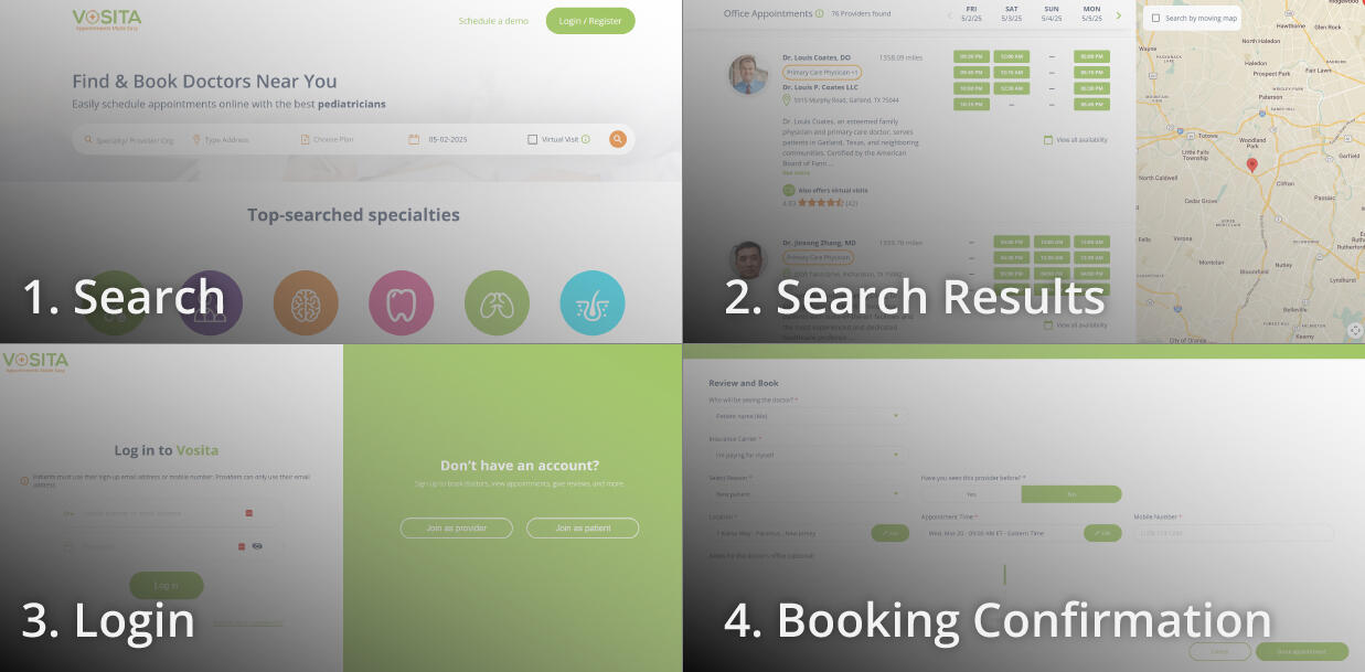
To tackle this, I broke the guest user journey into four key flows:
Search Bar
Search Results Page
Sign-Up/Login Flow and Credentials Confirmation
Booking Page
Let’s dive into the first flow: the search bar.
1. Search Bar

Search bar on homepage—before

The search bar was packed with fields: provider/specialty, location, insurance, date, and a virtual visit checkbox, followed by three buttons: search, more filters, and reset. While functional, it felt overwhelming and could use some simplification.
Provider/Specialty Field: Users could type a provider’s name, but even if the provider appeared in the dropdown, clicking on them didn’t take users directly to their profile. Instead, they had to hit “search,” wait for the results page, and then click on the provider again. I thought, Why not let users go straight to the provider’s profile if they’re already selecting them from the dropdown?
Location Field: This field started blank, requiring users to manually enter their location. If they declined the browser’s GPS prompt, we defaulted to an IP-based location, which was less accurate. This led to confusion and frustration, especially for users who weren’t sure why their location wasn’t auto-populated.
Insurance Selection: This was the #1 pain point, reported by about 18% of users. The process was split into two tabs: carrier and plan. Users would first select a carrier from an alphabetical list, then choose a plan. However, they could skip the carrier step entirely by clicking the “Plans” tab, which broke the UI. I thought, Why not make carrier selection more intuitive and prevent users from advancing without selecting a carrier first?
Date Field: The date field auto-filled with the current day in “MM-DD-YYYY” format. While helpful, not all users immediately recognized today’s date, so I considered making the date display clearer and more user-friendly.
Virtual Visit Checkbox: This was another point of confusion. Users weren’t sure whether checking the box would include virtual visits alongside in-office appointments or show only virtual visits (it was the latter). This lack of clarity added unnecessary cognitive load.
Buttons: At the end of the search bar were three identically styled buttons: search, more filters, and reset. Not only were they unlabeled (relying on hover tooltips), but the most important button—search—was placed first, followed by the less critical ones. Considering the serial position effect, I thought, Shouldn’t the search button be more prominent and placed last to guide users naturally through the flow?
Mobile Web Experience: On mobile web, the search bar stacked vertically, extending below the fold on page load. This created a jarring experience where users would hit “search” and not realize they’d navigated to a new page because the search bar looked identical on both the homepage and search results page. I believed a more compact, mobile-friendly search bar was needed to provide better visual feedback and improve usability.
This analysis highlighted several opportunities to streamline the search bar and reduce cognitive load, setting the stage for a more intuitive and efficient booking experience.
2. Search Results Page

Search results page—before

Provider cards on mobile stacked vertically, with the provider info on top and the timeslot at the bottom. This resulted in long cards that occupied the entire screen. I thought compact cards that allow for 2-3 providers to be displayed at the same time would reduce scrolling and improve the experience.
3. Sign-Up/Login Flow and Credentials Confirmation
Clicking on a timeslot in the search results led to the login page. Unregistered users had to navigate through sign-up, log in again, then return to the booking page, only to verify their emails and add their mobile numbers, resulting in significant drop-offs and a convoluted process.I realized most guests wouldn’t be registered on Vosita, so it made more sense to redirect them to sign up by default instead of login. I also thought redirecting away from the search results page was unnecessary and proposed displaying a sign-up modal when a guest selects a timeslot.Additionally, I questioned the need for email verification. Patients signing up with a mobile number could use it for login as well. I believed the sign-up fields could be fewer, and that we could verify mobile numbers or emails during sign-up. This way, after creating accounts, users would be automatically signed in and redirected to the booking page, where they’d only need to confirm appointment details without additional verification steps.This reimagined flow aimed to eliminate unnecessary steps, reduce friction, and create a seamless experience for users.
4. Booking Page

Booking page—before

The booking page was too wide, with rows containing up to 4 fields. I thought the layout didn’t guide the user effectively. A narrower layout with fields stacked vertically would create a more intuitive and focused experience.This deep dive into the guest user journey revealed multiple pain points and opportunities for improvement. By addressing these issues, I aimed to create a smoother, more efficient booking experience that would reduce frustration and increase completion rates. Stay tuned for the next chapter, where I’ll explore how I translated these insights into actionable design solutions in the Make phase.
Chapter Two: Make
1. Search Bar
I reworked the search bar to make it more intuitive and efficient, starting with the following key updates:
A. Provider Field
I updated the flow so that when a user searches for a provider and selects them from the dropdown, they’re taken directly to the doctor’s profile page. This eliminated the extra step of hitting “search” and then clicking on the provider again in the results.I also simplified the placeholder text. It originally read, “Provider Specialty/Provider/Org,” but I changed it to “Doctor, specialty.” I’ve been advocating for using “doctor” instead of “provider” across the platform because it’s simpler and resonates better with the average patient.
C. Insurance Selection
I kept the two-tab layout (carrier and plan) but updated the UI to make it more user-friendly. I alphabetized the list and added a “Popular” section at the top, which displays carriers commonly used in the user’s location.To prevent users from skipping the carrier selection, I made it so they can’t proceed to the “Plans” tab without first choosing a carrier. I also added a sticky “Continue without insurance” button for users who either aren’t sure about their insurance or don’t have it. This gave users more flexibility while maintaining a clear path forward.
D. Date Field
The date field previously auto-filled with the current day in “MM-DD-YYYY” format. I changed it to simply display “Today.” My reasoning was that not all users would immediately recognize the current date, and I wanted to save them the effort of checking their phone or another part of the screen to confirm. “Today” is clear, affirming, and reduces cognitive load.
E. Virtual Visit Checkbox
I removed this field entirely. Vosita launched in 2020 during the peak of the COVID-19 pandemic, when telemedicine was a top priority. However, as the platform evolved, this checkbox felt like a relic of that time.Since virtual visit options were already available in the filters on the search results page, I decided to remove this checkbox to reduce cognitive load and streamline the search process. My goal was to get patients searching and viewing doctors as quickly as possible.
F. Buttons
I removed the “More filters” and “Reset” buttons from the search bar. These buttons competed with the “Search” button and weren’t essential to the initial search experience. By eliminating them, I was left with a single, prominent orange “Search” button. This made the interface simpler and more focused, encouraging users to start their search right away.
G. Mobile Web Experience
On mobile, I eliminated the gaps between fields to create a compact search bar that fits above the fold on most devices. On the search results page, I replaced the original search bar (which was identical to the homepage version) with a new sticky bar.
This sticky bar displays the appointment type and the number of doctors found, along with a “Filters” button that opens an overlay for adjusting search criteria. This change completely eliminated the confusion users experienced when they didn’t realize they’d been navigated to a new page after hitting “Search” on the homepage.The new sticky bar takes up minimal vertical space, allowing the list of providers to be displayed front and center. This aligns better with user expectations and creates a more seamless experience.These updates to the search bar were designed to reduce friction, minimize cognitive load, and get users to their desired results as quickly as possible. By simplifying the interface and streamlining the flow, I aimed to create a more intuitive and efficient booking experience. Stay tuned for the next section, where I’ll dive into the changes I made to the search results page and beyond!

Search bar on homepage—after

2. Search Results Page
On mobile, vertical space is precious. To optimize the layout, I eliminated the provider summary that was displayed on desktop under each result. Instead, I kept only the essentials: the provider’s photo, name, specialty, location, rating, and available time slots.Time slots were a major space hog, so I reimagined their display. Instead of the 5-column grid used on desktop, I streamlined it to show only the time slots for the day the user searched for, displayed in a single row with side scrolling. This approach minimized vertical space, allowing up to 3 providers to be displayed at a time. The result? Less scrolling and a more intuitive browsing experience for users.

Search results page—after

3. Sign-Up/Login Flow and Credentials Confirmation
I shifted the flow to assume that guest patients likely didn’t have accounts on Vosita. Now, when users click on a provider’s time slot, they’re taken directly to the sign-up flow instead of being redirected to the login page first.To preserve continuity, I designed a sign-up modal that pops up when a patient selects a time slot. This keeps users on the same page, eliminating the jarring experience of navigating away.
I also simplified the sign-up form by removing the “Confirm Password” field, since we already had a “Forgot Password” option on the login page. By default, we now only ask for a mobile number instead of requiring both an email and mobile number. Users can optionally add and verify their email later, but the mobile number is sufficient for booking.
To make the process even smoother, I added Single Sign-On (SSO), allowing users to skip filling out fields altogether and go straight to the booking page to confirm their appointment.
These changes significantly reduced friction, enabling users to complete the process in fewer steps and with less effort.
4. Booking Page

Booking page—after

I completely redesigned the booking page to make it more user-friendly. The new layout is narrower and uses a single-column design, creating a more focused and guided experience.At the top of the page, I added an appointment summary that displays the provider’s details and the selected time slot. Below that, I stacked the fields vertically, grouping them into sections based on the type of information (e.g., personal info, appointment info, etc.).
Since mobile numbers are now collected and verified during sign-up, the mobile number field is pre-filled, and we no longer ask new users to verify their email. This means most fields are already filled in by the time users reach the booking page. For most patients, it’s as simple as reviewing the summary and hitting “Book Appointment”—done!These updates to the search results page, sign-up/login flow, and booking page were all aimed at creating a smoother, more intuitive experience for users. By minimizing friction, reducing unnecessary steps, and optimizing the layout, I was able to streamline the entire booking process. Stay tuned for the Check chapter, where I’ll share the results and impact of these changes!
Chapter Third: Check
Key Metrics and Results
1. Total Journey Time
Before: The average total journey time was 11 minutes, with guest users taking around 13 minutes and logged-in patients taking 11 minutes. The worst-case scenario was 17 minutes.
After: The average total journey time dropped to 4.2 minutes, with guest users completing bookings in 4.5 minutes and logged-in patients in 4 minutes. This met our goal of a sub-5-minute booking experience.
2. Completion Rates
Before: Approximately 30% of guest users and 40% of logged-in patients failed to complete bookings on mobile web and app.
After: Completion rates improved significantly, with 100% of patients successfully booking appointments.
3. User Feedback
Users reported that the process felt faster, simpler, and more intuitive.
The removal of unnecessary steps (e.g., email verification, redundant fields) was particularly well-received.
The sticky search bar on mobile and the compact provider cards were praised for making the experience more seamless.
4. Reduced Cognitive Load
Simplifying the search bar (e.g., removing the virtual visit checkbox, streamlining insurance selection) led to a noticeable decrease in user confusion.
The single-column layout on the booking page and the appointment summary at the top helped users feel more in control of the process.
5. Mobile Optimization
The compact search bar and side-scrolling time slots on mobile reduced scrolling and made the search results page easier to navigate.
Users appreciated not being redirected to a new page during the sign-up process, as the modal preserved continuity.
Takeaways
1. Assumptions Can Be Powerful (When Validated)
Assuming that most guest users didn’t have accounts and directing them straight to the sign-up flow proved to be a game-changer. This small shift eliminated unnecessary steps and reduced frustration.
2. Less Is More
Removing non-essential fields (e.g., virtual visit checkbox, confirm password) and simplifying the UI significantly improved the user experience. Users don’t need every option upfront—they just want to complete their task efficiently.
3. Mobile-First Design Is Critical
Optimizing for mobile wasn’t just about aesthetics; it was about respecting users’ time and attention. The sticky search bar and compact provider cards were small changes that had a big impact on usability.
4. Continuity Matters
Keeping users on the same page (e.g., using modals for sign-up instead of redirects) helped maintain focus and reduced the likelihood of drop-offs.

Provider Profile Redesign—Vosita
Overview
When I first looked at Vosita's provider profiles in late 2022, I immediately noticed how much mental effort it took to find basic information. It was a struggle navigating the dense, unstructured information. The existing design didn't support how people actually research healthcare providers - they needed clearer pathways to key information and booking.
The Challenge
Important details like specialties and availability were hard to find in the wide, two-column layout
The booking CTA disappeared when scrolling
Reviews required leaving the page, disrupting the decision-making process
My Role
User Experience
Visual Design
Prototyping
Chapter One: Think
A. Analyzing the Guest User’s Journey

Provider Profile—before

User testing sessions revealed consistent patterns. People's eyes darted across the wide layout, struggling to build a complete picture of the provider. Many missed the booking option entirely after scrolling, while others abandoned the process when reviews opened in a new tab.We also discovered that providers with longer bios actually had lower conversion rates, suggesting our information hierarchy was broken.
Profile originally had:
A wide header with the provider’s name and a non-sticky "Availability" button.
A small left column with the bio and map.
A wide right column with scattered details and reviews at the very bottom.
Key Pain Points:
Users missed the booking CTA after scrolling.
Reviews were buried.
Mobile users had to scroll excessively.
Chapter Two: Make
The redesign focused on creating clear information hierarchy. I moved from the sprawling two-column layout to a more structured single-column approach with a persistent sidebar. This kept the provider's core information and booking CTA always accessible.
Key improvements included:
Key improvements included:
A fixed sidebar with booking options that remained visible while scrolling
Integrated reviews that expanded in place rather than navigating away
Better mobile experience with prioritized informationA "Back to top" feature for long review sections
For mobile, I collapsed secondary information into expandable sections so patients could focus on what mattered most when making their decision.
Chapter Third: Check
Post-launch observations showed noticeable improvements:
More users were reaching the booking confirmation page
Providers reported increased profile engagement
Providers appreciated how their information was presented more professionally
This project reinforced how important information design is in healthcare - when we make interfaces clearer, we help people make better decisions about their care.

Login/Signup Redesign—Vosita
Overview
Vosita’s signup and login experience was fragmented, confusing users with a cluttered split-screen layout, unclear messaging, and unnecessary friction—especially on mobile. My goal was to streamline the flow, reduce cognitive load, and ensure a seamless transition from account creation to booking appointments.
The Challenge
Cluttered Split-Screen Layout & Ambiguous Messaging

Login—before

The original design divided actions across two panels: forms on one side, alternate paths on the other. But instead of helping, this split created decision paralysis. Users hesitated when faced with ambiguous messaging—was “Hello there!” for new users or returning ones? Analytics showed many abandoned the flow after clicking the wrong option.
Overly Complex Sign-Up Flow

Sign up—before

The signup process added unnecessary hurdles. Requiring users to declare patient or provider status upfront felt like a bureaucratic checkpoint. Redundant fields (“Confirm Password”) and scattered legal checkboxes further slowed them down. And if someone accidentally navigated away? Poof—their progress vanished without warning.
Poor Mobile Experience
On mobile, the problem worsened. The stacked layout hid critical links (like “Log in”) below the fold, leaving users scrolling aimlessly.
Disjointed Post-Signup Experience
Post-signup, the experience fell apart. Users had to verify their email, manually log back in, and were dumped onto an empty appointments page—a dead end for someone just starting out. Success messages rambled without guiding next steps. It was clear: Vosita’s gateway needed a complete rethink.
My Role
I owned the end-to-end redesign, from research and wireframing to collaborating with developers on implementation. My focus was on reducing cognitive load, eliminating unnecessary steps, and ensuring a seamless transition from account creation to active use.
Chapter One: Think
Identifying Pain Points
Key issues:
Users frequently misinterpreted the split-screen layout, clicking the wrong action.
Mobile users missed login links due to poor visibility.
Password confirmation fields led to repetitive typing without clear benefit.
No safeguards existed to prevent accidental progress loss.
Key Pain Points:
Users missed the booking CTA after scrolling.
Reviews were buried.
Mobile users had to scroll excessively.
Chapter Two: Make
I moved everything to a single side and added straightforward options like, “Already have an account? Log in” or “Need an account? Sign up.” This way, users could see exactly where they were without extra clutter or mixed messages.I simplified the form, removed the “confirm password” field, consolidated all legal to one checkbox, and added a confirmation modal that popped up if they tried leaving mid-signup, so they wouldn’t accidentally lose progress.By keeping everything on one side, the essential options loaded fully on screen, saving users from unnecessary scrolling and improving clarity.I embedded verification into signup, added auto-login, and redirected them to the homepage where they could start booking appointments right away. I also shortened the success message so it stayed relevant and didn’t distract from their next steps.

Sign up—after


Sign up—after

Chapter Third: Check
Post-launch, I monitored feedback to fine-tune details. For example, some users initially missed the password visibility toggle, so I made it more prominent. Legal checkbox wording was adjusted for better readability after observing lingering hesitancy during testing.
While formal metrics weren’t tracked, the redesign achieved its core goals:
A clearer, more guided user journey.
Reduced friction in form completion.
Better mobile usability with critical actions at front and center.
A seamless post-signup handoff to the booking experience.